
Before we get into this discussion of what color temperature is I should explain the Kelvin scale. Color temperature is rated in degrees k (k in lower case) on the Kelvin scale which was invented by Scottish scientist William Thompson (Lord Kelvin). I am not going to get into a discussion on how William Thompson arrived at this scale but if you are interested you can do a Google search on him and there is plenty of information available on the subject.
The color temperature scale will apply to all color photography but white balance is only adjustable in post processing if you shoot RAW.
What is color temperature ?

The chart provided above indicates that 5500 degrees k is daylight. Anything lower than 5500 degrees k will impart a yellow to red quality of light to your images and anything higher will impart a blue quality. If you remember in previous lessons I stated that I take a lot of images around “Golden Hour”. If you look at the Kelvin scale you will see that Sunrise/Sunset and Golden Hour are on the warm side of the scale and the quality of light is on the yellow to orange. The example below will verify how the quality of light (or color temperature) will correspond with the kelvin scale.
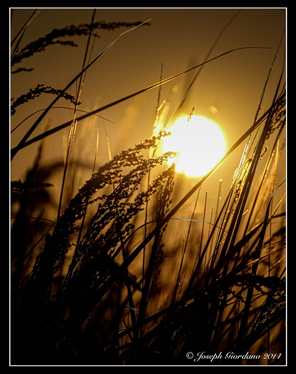
The above photo was taken right after sunrise and the color temperature is about 3300 degrees k. If you look at the Kelvin scale at 3300 k you will see what color light influenced the above image.
I know the above explanation is fairly basic but I think it is easy enough to understand just by looking at the chart.
Why should I worry about color temperature because the camera seems to do a good job adjusting it on its own ?
The camera does a very good job of adjusting white balance on its own and I suggest you leave it Auto white balance. I am suggesting that you shoot RAW rather than jpg files because if the camera is slightly off with its white balance choice at least you can correct it in post processing.
But my camera is always spot on and I never feel the need to adjust white balance Joe.
That might be true but you must be very lucky because sooner or later you will have to adjust white balance to achieve proper color. I will show you a couple of examples below and while the white balance is only slightly off it makes a big difference when working with a color calibrated monitor (as I am) and if you print your photos. Most people do not see white balance problems until they print their image and waste expensive photo paper.

In the above example this is a pretty straight forward image of some flowers and the camera did a pretty decent job with the white balance 4750 degrees k. Upon a closer inspection you might notice the white petals take on a bluish green tint because of the light reflected off the background foliage.

In this example I corrected the white balance by raising the color temperature in Lightroom to 5100 degrees k which is more like the scene I saw with my eyes. Even though the color temperature was only raised by 350 degrees k the white petals are more correctly displayed.

In this example I changed the color temperature to daylight in Lightroom 5500 degrees k but I think its a little too much to my liking so the second example looks more correct to me. Some of you might not even notice these changes I am making because you are using a small screen or a notebook computer but I can assure you with a 27′ monitor like the size I am using the changes are plain as day.
Let me show you a different example.

This image was taken in Niagara Falls from the Canadian side and the image looks pretty good. I didn’t like the bluish tint to the spray and the water coming over the falls. This photo was taken on Auto white balance at 4950 degrees k. Lets try to correct that water in the next image.

This is a little bit better the water is closer to the original color and the spray looks whiter. The surroundings look like mid April in Ontario (when this image was taken) before the leaves started growing on the trees. This was corrected to daylight or 5500 degrees k in Lightroom.
If you shoot RAW files you should try going back into your photo archives and try to find some that might benefit from a small white balance adjustment.

Another wonderful explanation Joe, this time about the peskiness that is white balance . . . I remember my early experiences with the DSLR wondering why everything in Death Valley looked so strangely blue!
LikeLike
Thank you Patti and I love the word “peskiness” 🙂
LikeLike
Thanks a lot Joe for the through and prompt explanation. I feel more relieved now, since my interest is not in printing material for sale or otherwise. If pictures look pretty decent on the readers’monitors, that’s good enough for me.
You are gaining great respect both for your awesome pictures and for your crystal clear tutorials. I will mention them in a future blog post so photo enthusiasts can get more acquainted with the basics of photography. There is a drought for this sort of tutorials for newbies like me.
Best Wishes,
Omar.-
LikeLike
Thank you very much Omar, enjoy your day 🙂
LikeLike
Joe, you mentioned something about calibrating your monitor. Exactly what do you mean? I have a LED 22″ LG monitor and have never calibrated it as far as color is concerned because back then I was not into photography. Could you expand on this subject in future tutorials? Maybe the red in my monitor is not exactly the correct calibrated red in the Kelvin scale.
FYI, I’m not interested in selling printed material. Only practice photography as a hobby, but am willing to learn as much as I can in respect for my readers.
Thanks in advance,
Omar.-
LikeLike
Thats a good question Omar and I should have expanded on the subject in my post. If you are not selling prints you will not have to worry about calibrating your monitor. The whole idea behind calibrating your monitor is so your print colors match what you see on your monitor. This is the system I use – http://www.bhphotovideo.com/c/product/838844-REG/Datacolor_S4P100_Spyder4Pro_Software.html
If you are just concerned about posting photos on your blog I would not worry about calibration because there are just too many variables. Everyone uses different monitors to view photos on the web so the colors would not be the same on any one monitor.
LikeLike
I think one of the most challenging situations to get the white balance and colors right is indoors with many different lamps turned on. A great tutorial again Joe! And I do notice the difference in your photos! 🙂
LikeLike
Thank you Elina 🙂 Enjoy your day.
LikeLike
That image of the Kelvin scale is perfect! Really explains things visually and accompanies your words so well.
I had to chuckle at the “my camera is always spot on” … only if people like me don’t mess things up 🙂
LikeLike
LOL, thank you Laurie 🙂 Enjoy your Sunday.
LikeLike
Thanks for this great explanation–I’ve always just adjusted my white balance using the sliders, but never really understood what the numbers meant. I’m starting to do some studio work and purchasing lights, etc. (Makes you think about light in a whole new way.) Now I know what it all means.
LikeLike
Thank you Kamala and I am glad you enjoyed the post 🙂 Enjoy your weekend.
LikeLike
I’m a total amateur! Great lesson, Joe. Thank you.
LikeLike
Thank you very much Alys but your photos look anything but amateur 🙂
LikeLike
Well you are far too kind, but thank you nonetheless. I use exactly two settings on my camera, and I mostly take photos outside since I can never take a good one indoors. It’s fun though. I can easily see why people enjoy it. You see life in a whole different way.
LikeLike
Nothing wrong with two settings Alys, as long as it works 🙂 Thank you very much.
LikeLiked by 1 person
Thanks again Joe! I have been baffled about this white balance thing for a long time. Thanks for shedding light on this aspect of photo taking!
LikeLike
Thank you very much Gale 🙂 With the majority of processing programs like Adobe Lightroom, Photoshop or even Photoshop Elements the processing of RAW files has become fairly easy (and for those people with Macs, iPhoto is included free and that also processes RAW files). The only downside is the RAW files take up more space on memory cards but camera memory cards are fairly cheap now. I’m glad you enjoyed the post.
LikeLike
Ah… that’s how color temperature works! Thank you, Joe. I am smiling and happy because now I know. Can’t wait to see your next post. Helen
LikeLike
Thank you very much Helen I am glad you liked the post 🙂 Now that I started these posts every Friday I hope I don’t run out of interesting things to talk about, LOL. Just in case you don’t already know I have archived all of the Friday posts into a section called Tutorials in the menu system of this site.
LikeLike
Good review of how natural color works. When shooing abandoned interiors I get a lot of green spill from all the plants growing around the outside.
LikeLike
Thank you Robert 🙂 Spill is a great word to describe it I wish I would have used it on the flower example.
LikeLike
Next time 🙂
LikeLike
Excellent advice, Joe. It’s much easier to achieve proper color temperature in digital photography than it was in film. But there was a film trick that I continue to use and that is the inclusion of a gray card in a test shot when color balance is critical. I carry a small plastic one in my backpack and, while it is not feasible to use on landscapes like the Niagara Falls photo, it’s quite easy on still lifes, portraits and macro work. Outdoor portrait shooting can be tricky and the gray card will give you peace of mind since most RAW editors can easily produce an accurare color balance on the card.
LikeLike
Thank you very much 🙂 In film we had to use color filters of buy tungsten film if we were shooting indoors. The gray card is a great trick to get proper white balance and it saves a lot of money compared to the “Expodisc” although the disc can be used for everything. Thank you again for the tip I am sure the readers will appreciate it.
LikeLike